Retention mechanics & engagement strategy
Working closely with the product team, I shaped the core mechanics that give users a reason to come back. We validated every major decision through analytics, A/B testing, and real user feedback.
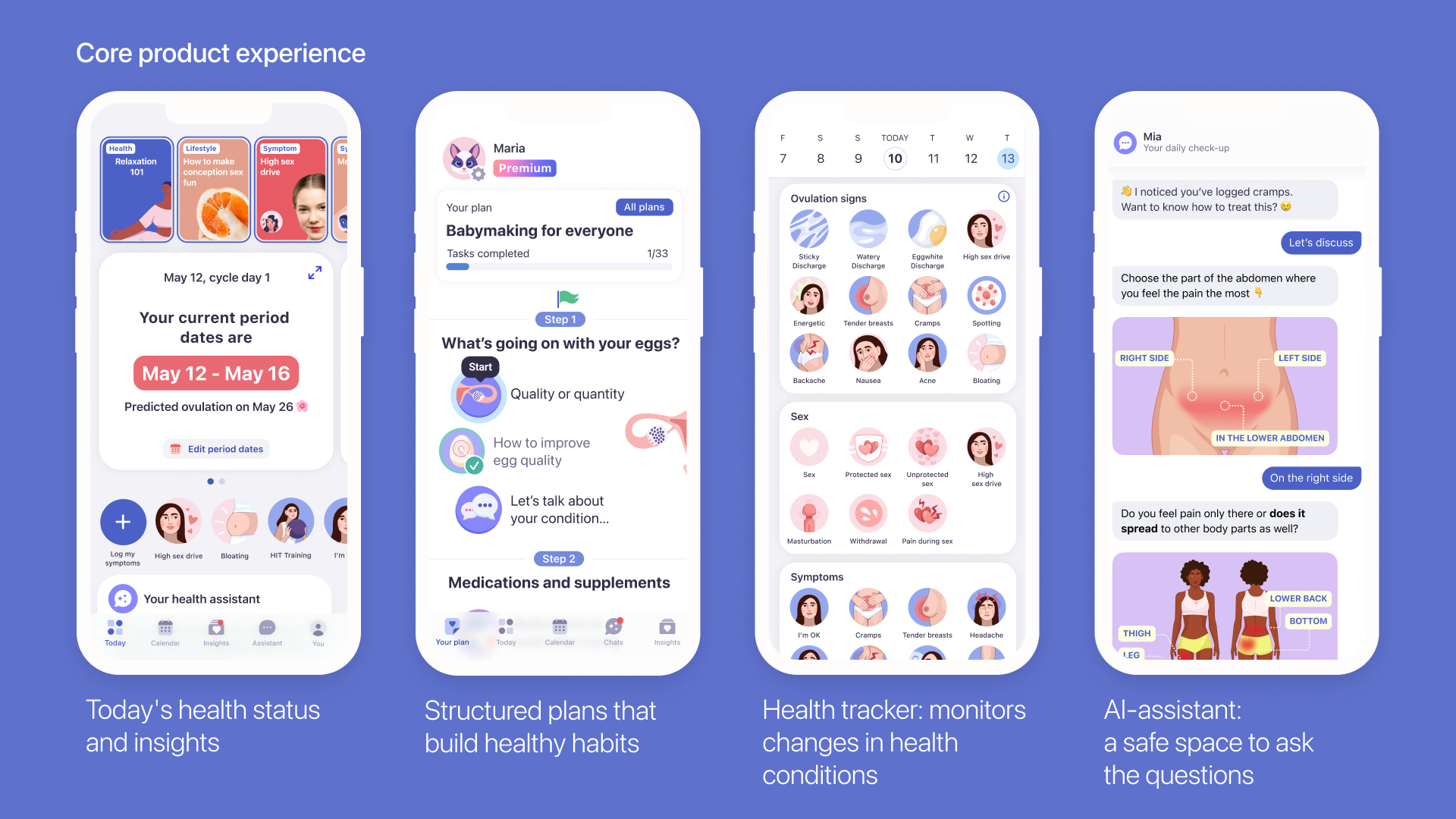
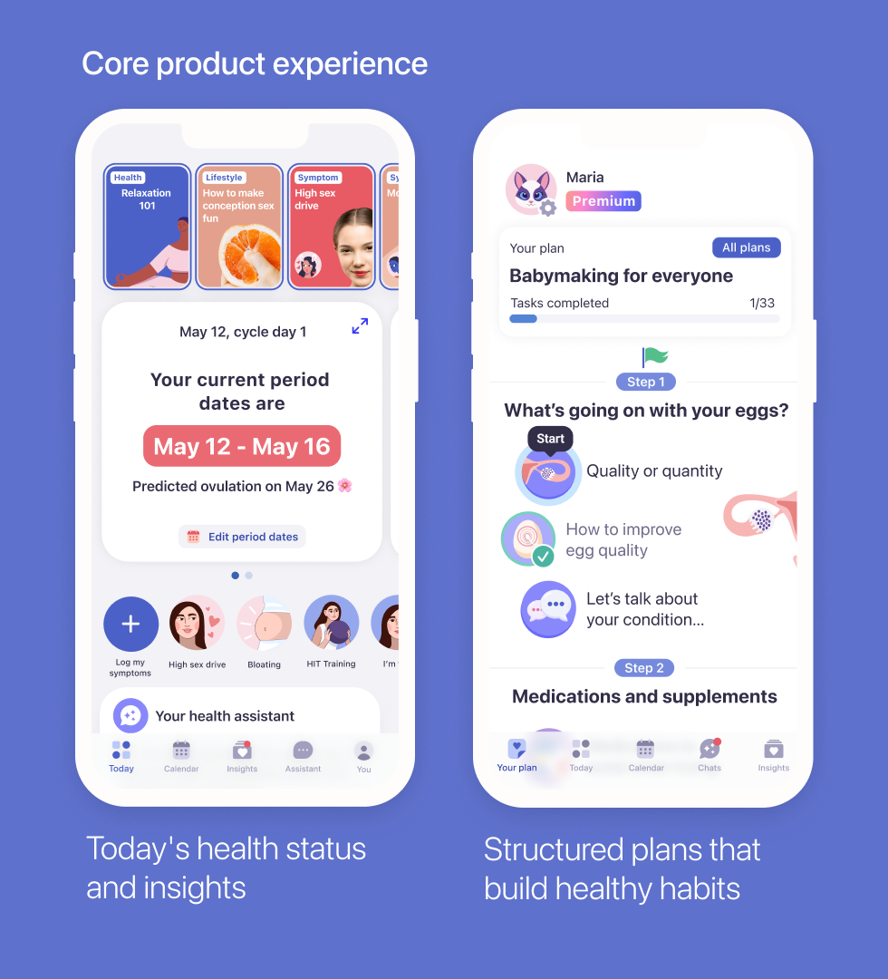
Cycle-based insights powered by logged behaviour
Daily insights built on each user's cycle data — so the app feels like it knows the user.
Fertility programmes & daily plans
Step-by-step guidance and routines supporting healthy habits formation.
Educational content & courses
Structured learning that deepens trust and makes the product feel worth paying for.
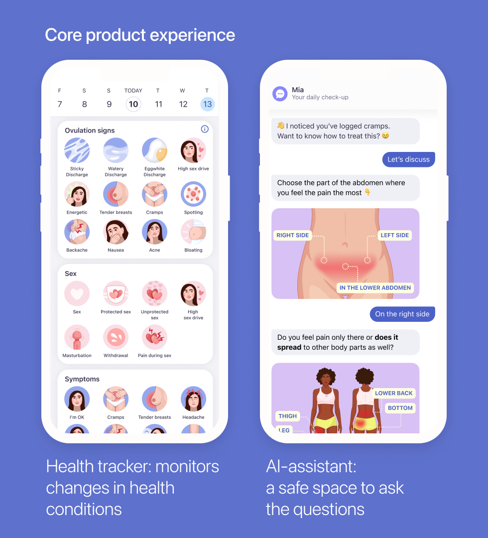
AI-chat support
A conversational layer for sensitive questions.
Pregnancy mode
A seamless transition into pregnancy tracking, so users don't have to leave when their journey changes.
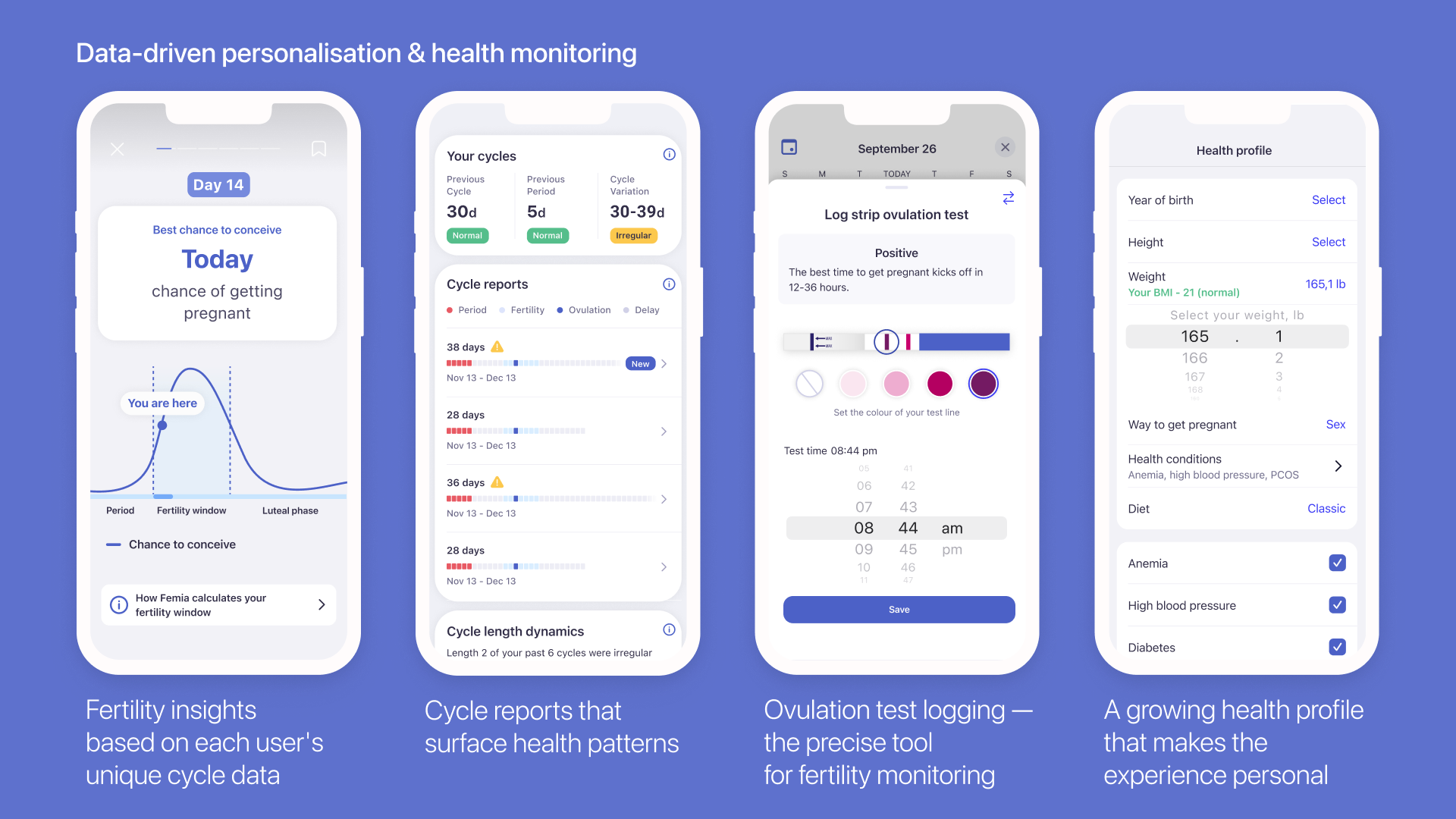
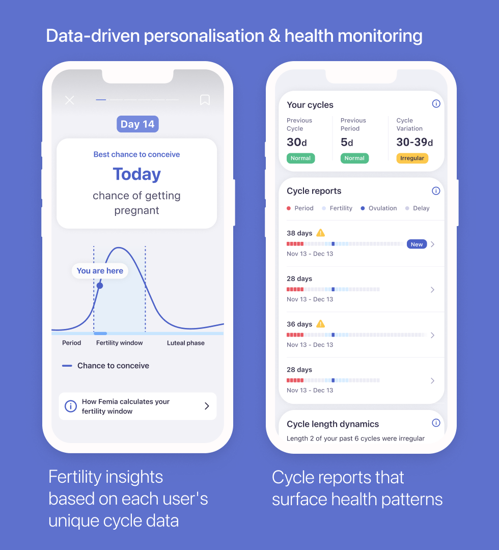
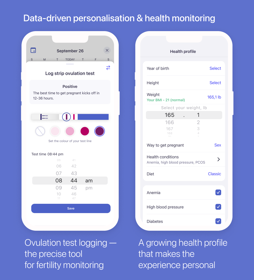
Data-driven personalisation & health monitoring
We built a suite of health monitoring tools that turned raw cycle data into clear, personal guidance — fertility window calculations, cycle pattern analysis, ovulation test logging, and a health profile that shaped daily insights and long-term recommendations.
The result was a product that felt like it genuinely understood each user's body, acting like a personalised health companion that got more useful with every cycle logged.
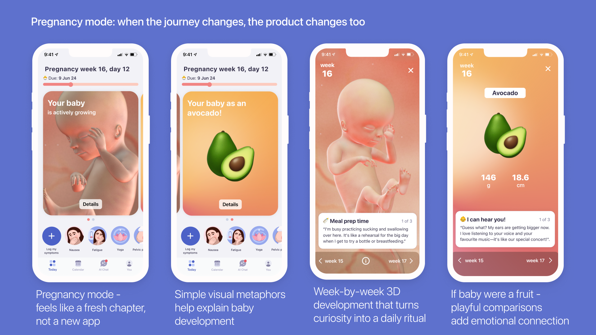
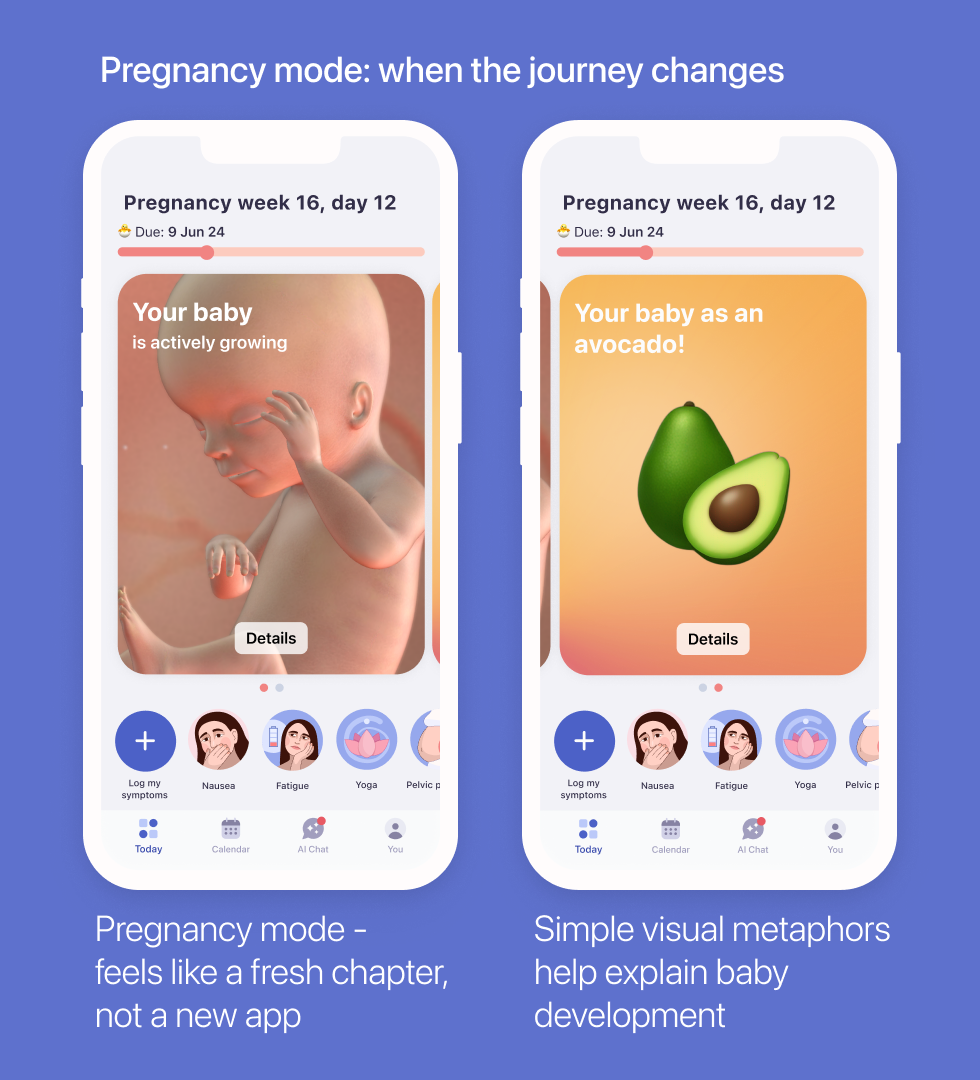
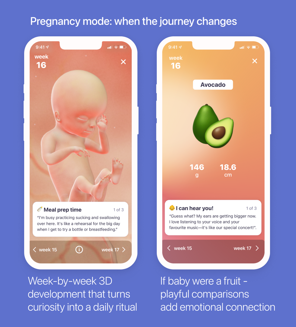
Pregnancy mode: supporting users through every life change
When a user becomes pregnant, her needs change completely — but she shouldn't have to leave the app to get support. Pregnancy mode was designed to make that transition feel seamless, keeping users in a product they already trusted rather than forcing them to start over somewhere else.
We built a dedicated pregnancy experience woven into the same product: week-by-week guidance, tailored health content, and a tone that acknowledged this was a different chapter — not a different app.
Crucially, the experience was designed with the full arc in mind. When pregnancy ended, Femia was ready to welcome users back — reconnecting them with their cycle, their goals, and their health data, exactly where they left off.
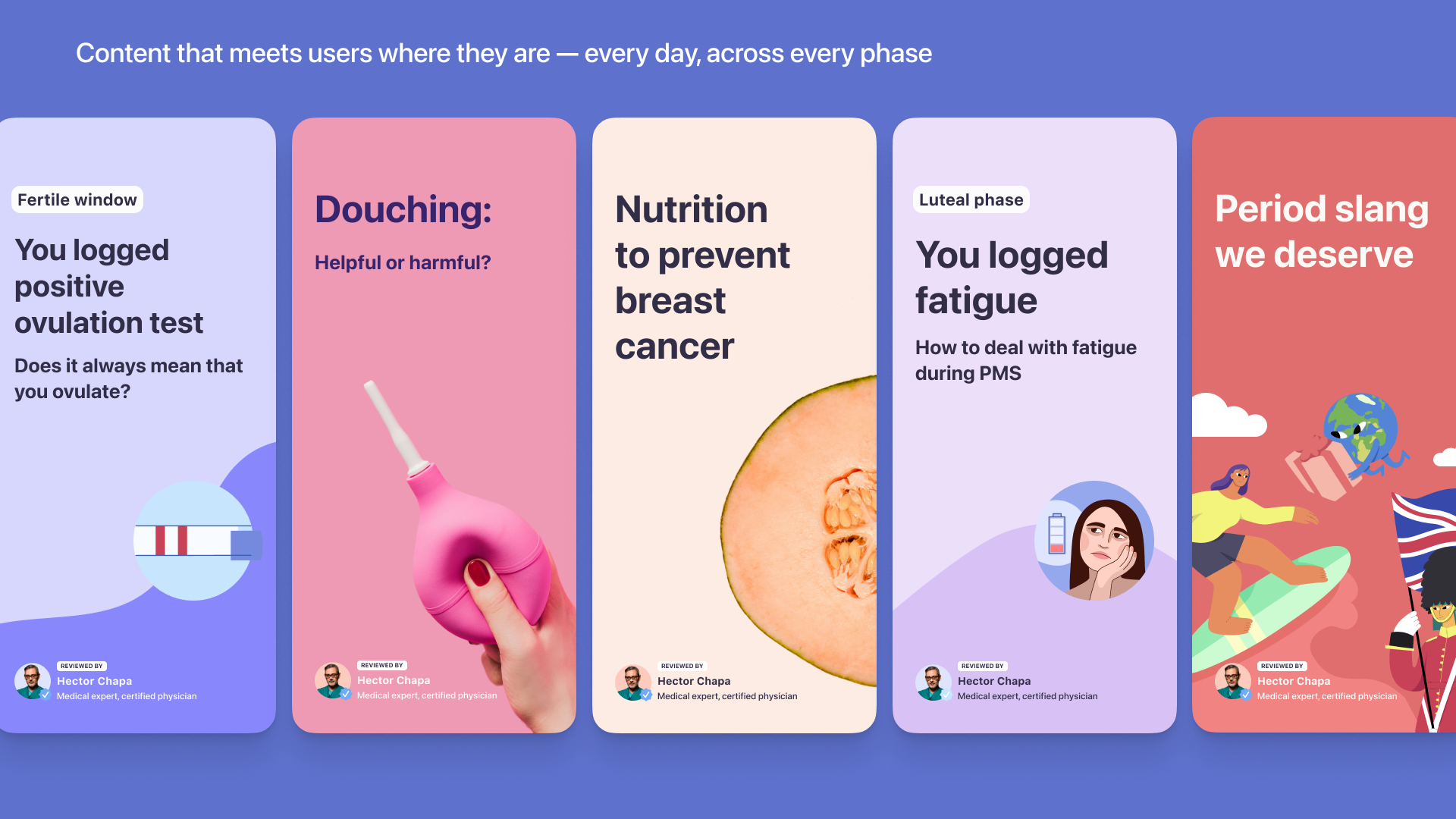
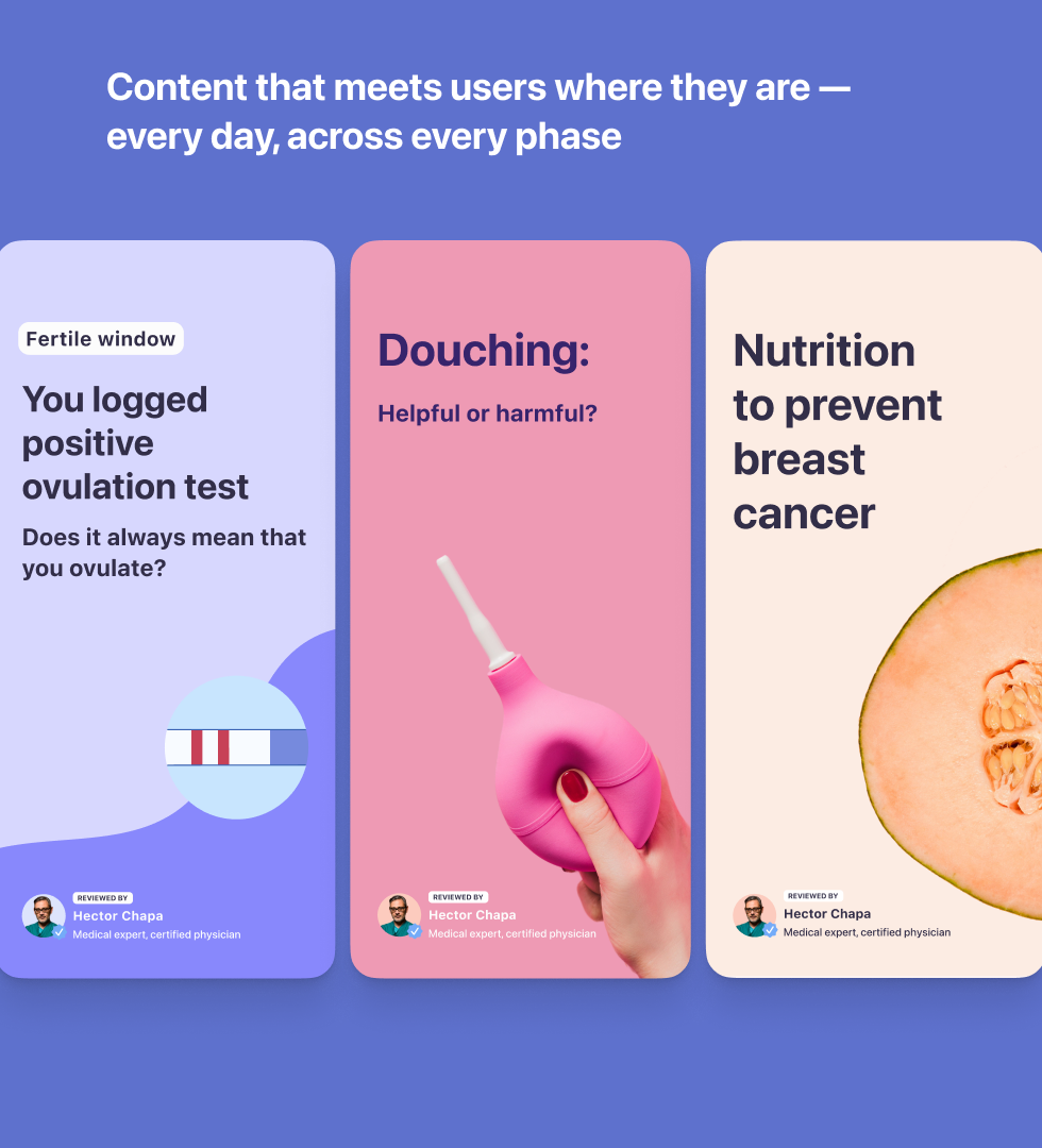
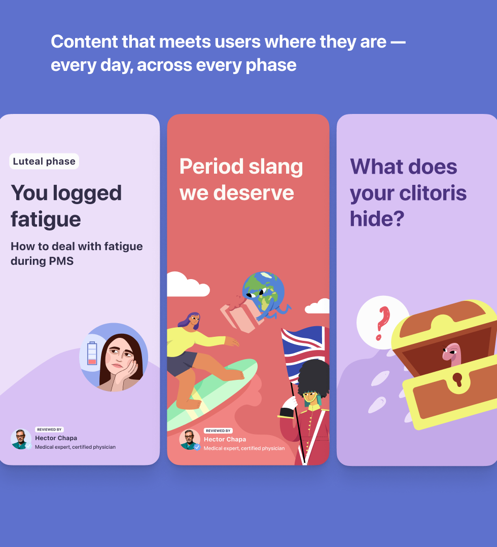
Personalised content as a core retention engine
From early on, content was treated not as an addition to the product but as a core retention driver. The goal was to build a digital companion that gives users something genuinely useful every single day, not just when they open the app to log something.
We built a continuous delivery system that adapted to each user's cycle phase, fertility goals, and logged symptoms.
Users received:
- daily stories and insights tailored to their cycle
- fertility forecasts and phase-based guidance
- contextual advice triggered by their logged symptoms
- educational content reviewed by certified medical experts
The result: the app stopped feeling like a tracker and started feeling like something worth coming back to.
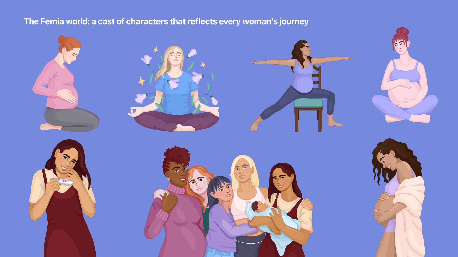
Brand identity & emotional positioning
I named the product — Femia — and led the development of its full brand identity, from visual language to emotional positioning.
The brief was clear: stand apart from the sea of pink or clinical period trackers and build something women actually want to be seen using.
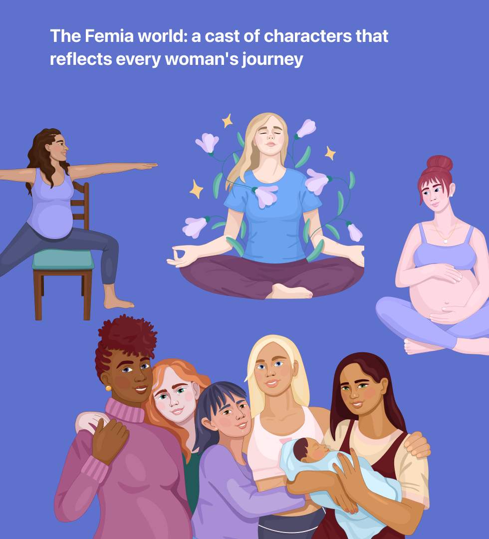
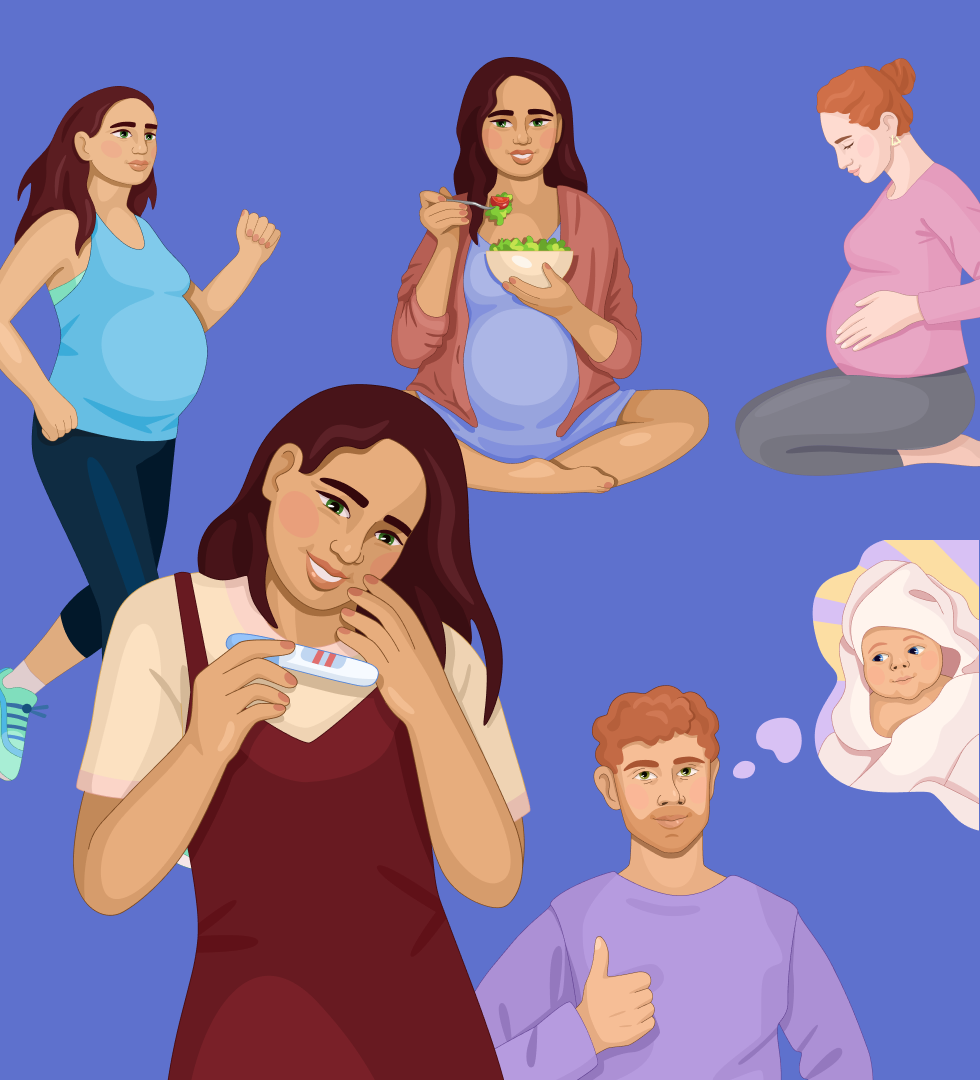
The result was a warm, modern identity built around real women at every stage of life — diverse, grounded, and quietly confident rather than overly medical or aggressively feminine.
The illustration style and visual tone weren't guesswork — both were validated through user feedback and performance testing, then refined until they became one of the most recognisable parts of the product experience.
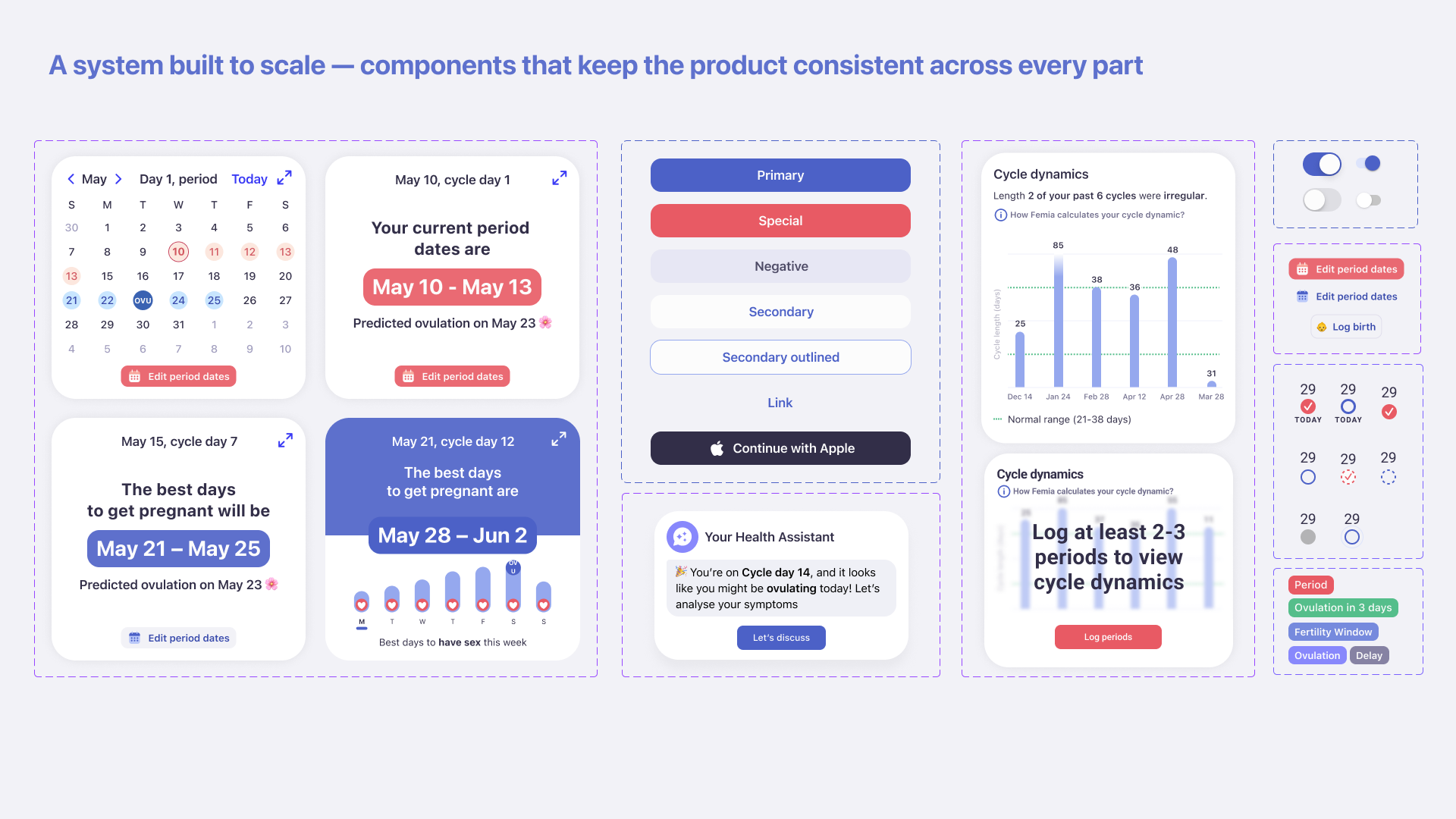
Design system & product operations
Building across iOS, Android, and Web required a design system that could scale without breaking. I built it from scratch to ensure consistency, speed up production, and give the team a shared language to work from.
Core library
A multi-platform foundation of components, layouts, and a character library built from zero, supporting platforms simultaneously.
Content templates
A dedicated design framework for content delivery, covering articles, educational highlights, and AI chat interactions, so content could be produced at scale without losing visual consistency and supporting multiple languages.
Library of visuals
A comprehensive system of illustrations and brand visuals that unified the product's identity across both the app and content experience.
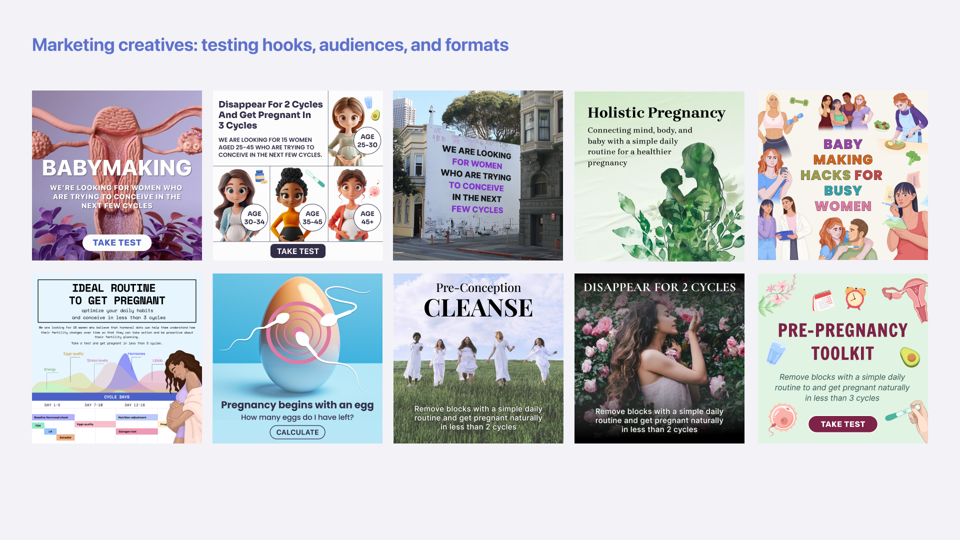
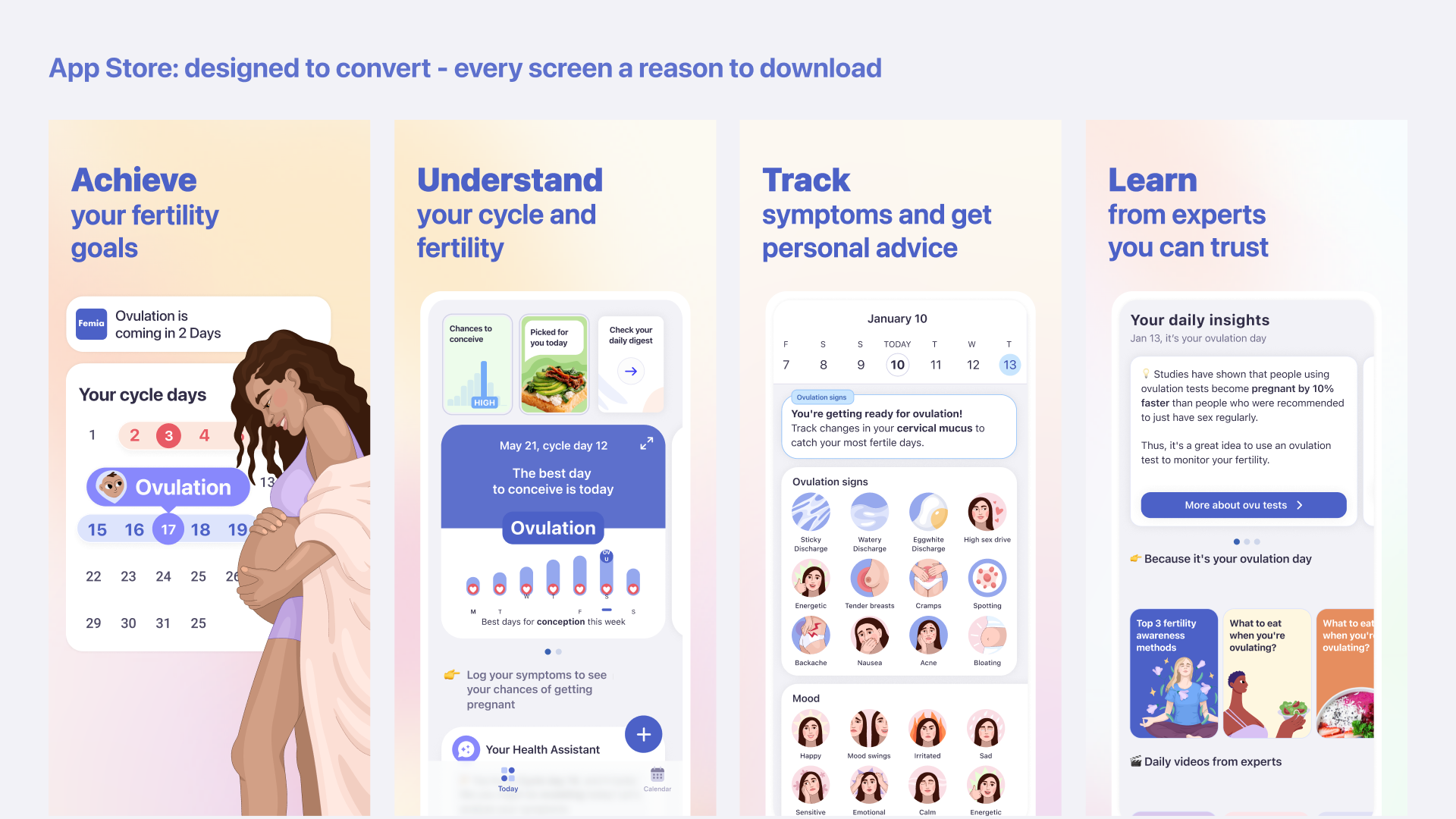
Marketing & user acquisition
I was responsible for making sure the visual and UX foundation held together across every acquisition and onboarding touchpoint, from marketing creatives to App Store assets to the first screen a new user sees.
To support continuous growth testing, I built a unified design system covering all acquisition surfaces. This let the team iterate fast on hypotheses without sacrificing visual consistency or brand coherence.
I worked closely with growth and marketing — reviewing creatives, aligning UX solutions with the overall product direction, and maintaining quality as the team continuously tested new channels and approaches.
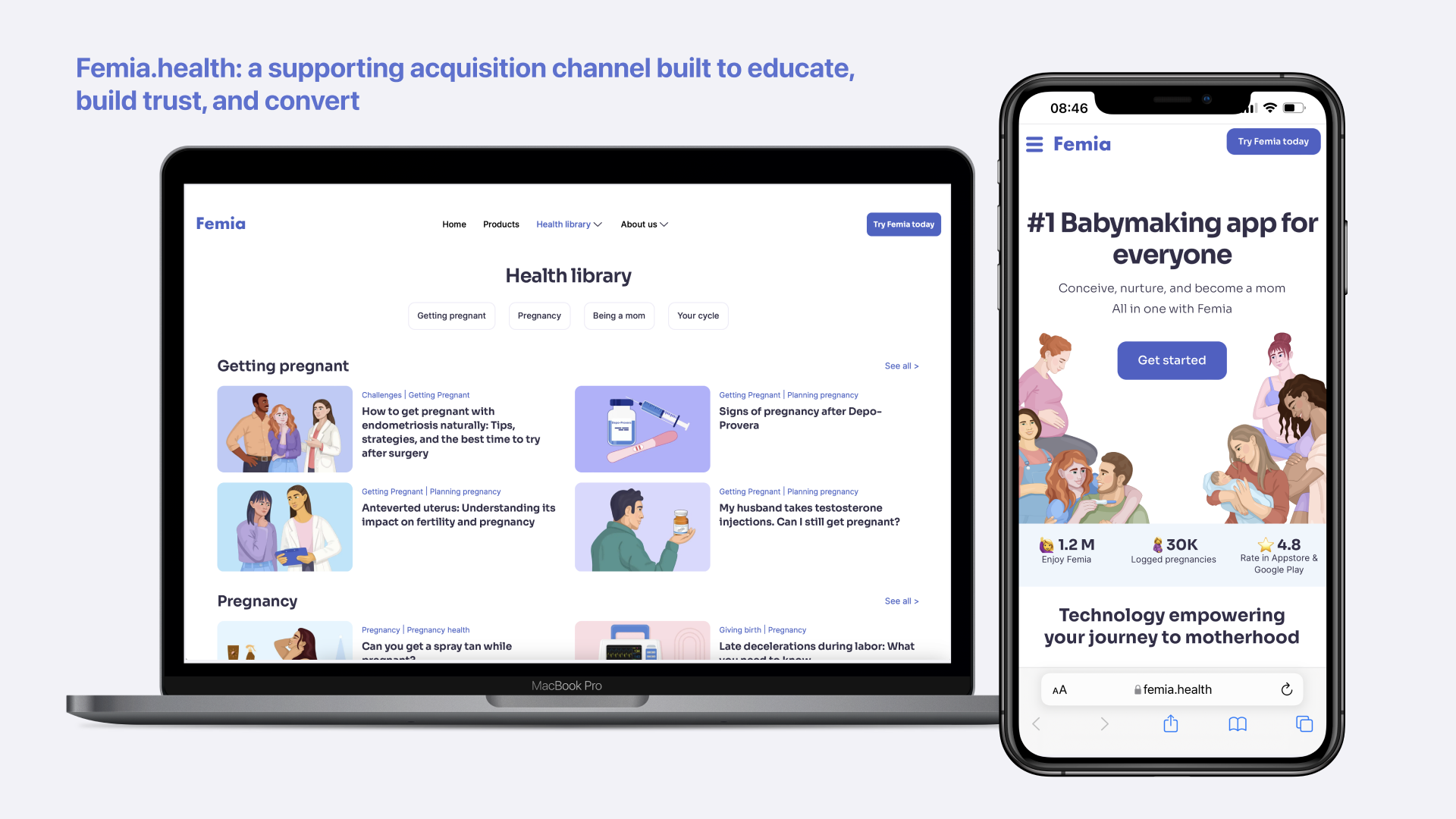
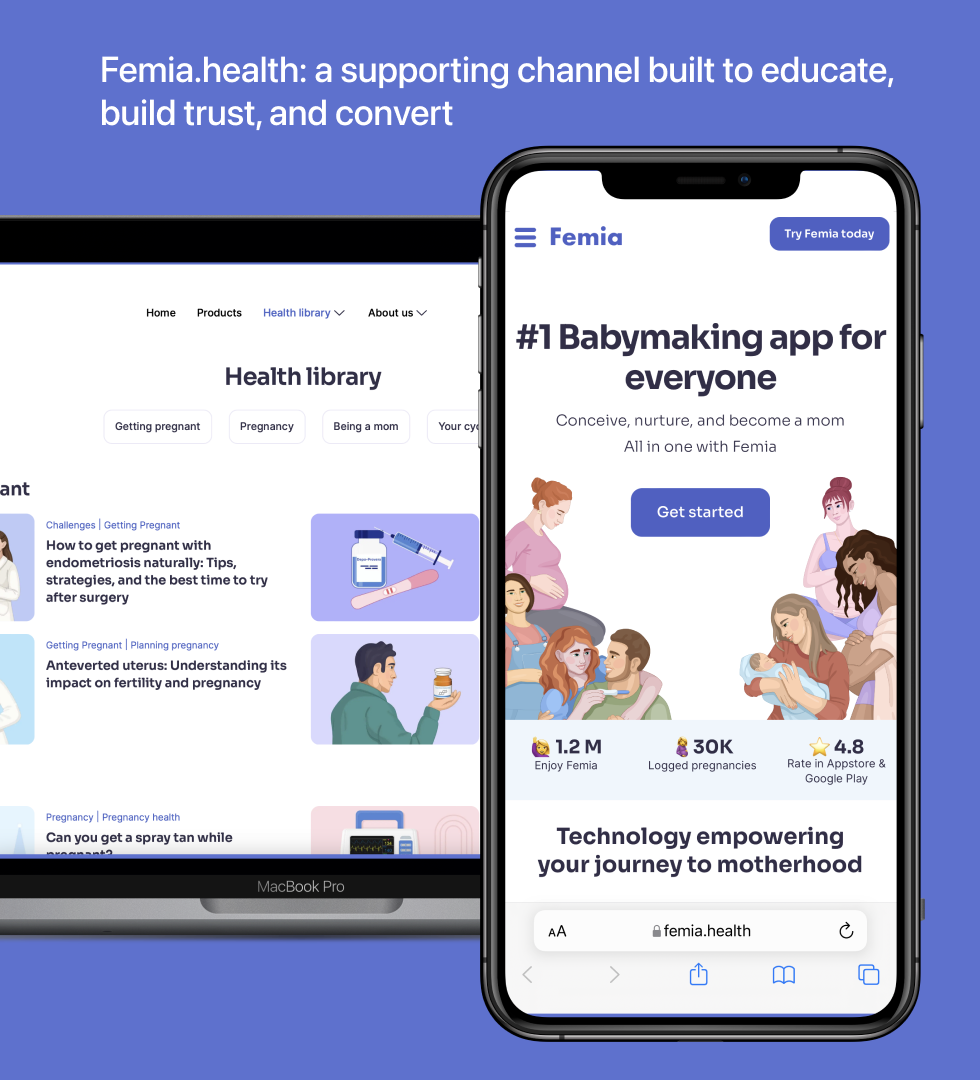
Femia.health: a web platform designed to attract, educate, and convert
The mobile app wasn't the only entry point — we designed femia.health as a full acquisition, content, and brand trust channel in its own right.
To drive organic traffic and support conversion, we built a suite of functional tools — pregnancy, IVF, implantation, and hCG calculators — that delivered immediate value to users before they ever downloaded the app. Each tool was designed to guide users naturally into web onboarding or app install.
Combined with the health library and brand content, the website became a meaningful secondary channel — capturing organic traffic and building brand credibility.