Brand foundation
The brand started with a clear mission: improve women's health and wellbeing through accessible technology. Everything else — visual identity, tone, illustration style — was built to serve that intent.
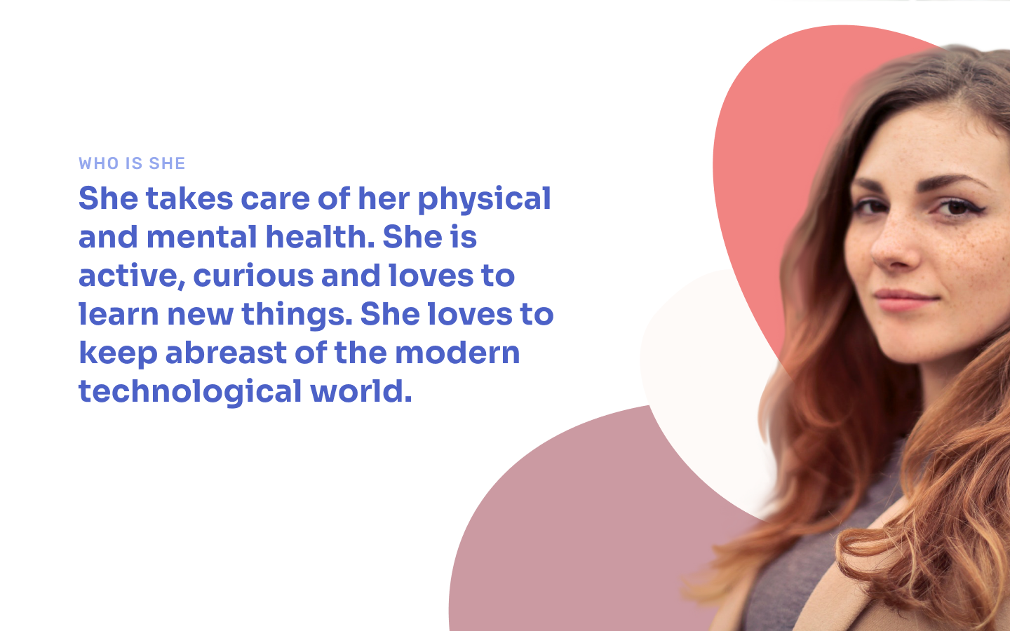
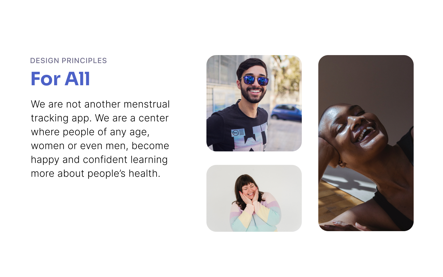
The target user isn't an abstract demographic. She's active, curious, health-aware, and expects a product that understands her without talking down to her. That profile shaped every design decision from colour to copy.


Values & design principles
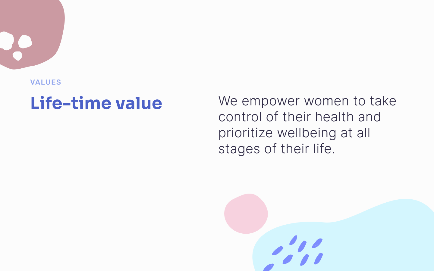
The brand values centre on life-time companionship — empowering women to take control of their health at every stage of life, not just at a single moment.
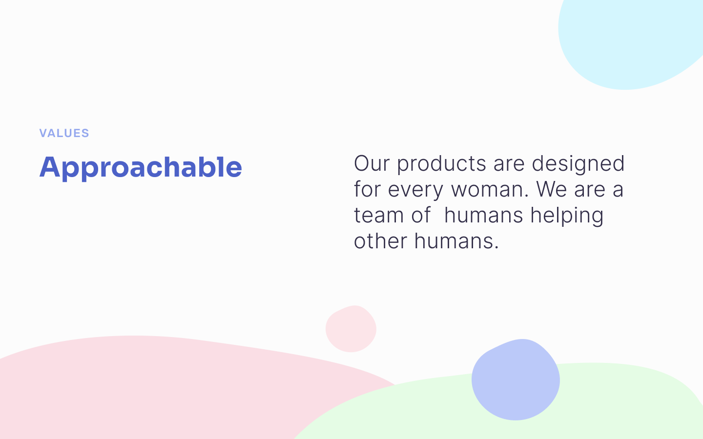
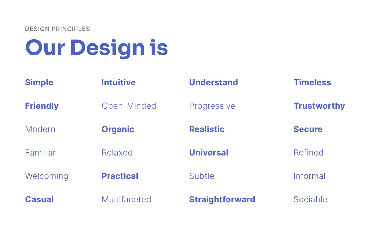
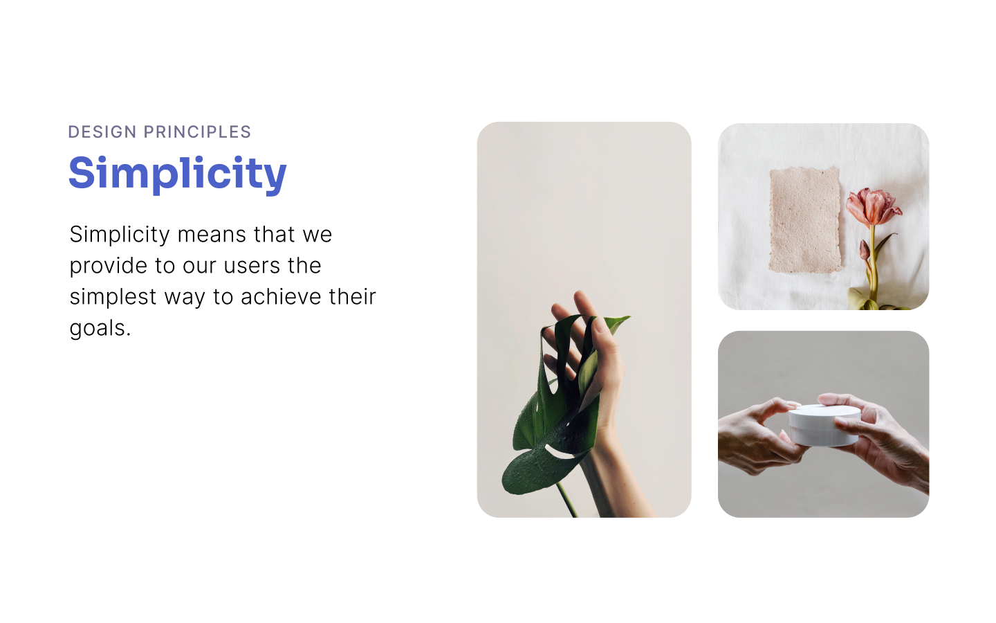
The design principles reflect this: simple, intuitive, friendly, trustworthy, and universal. The language had to be warm and caring while remaining expert and calm — never preachy, never patronising.

Logo & colour system
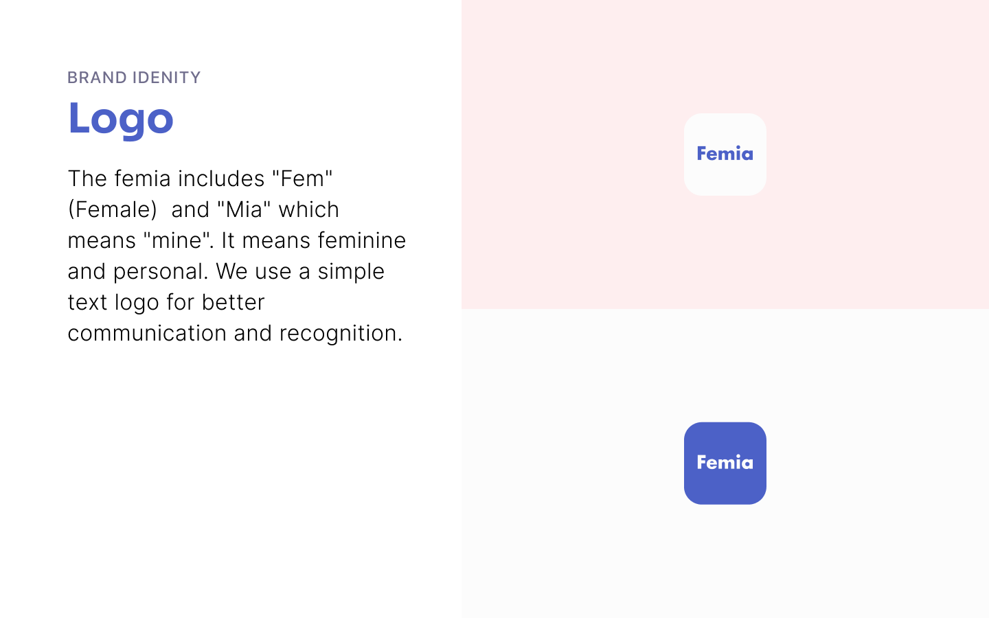
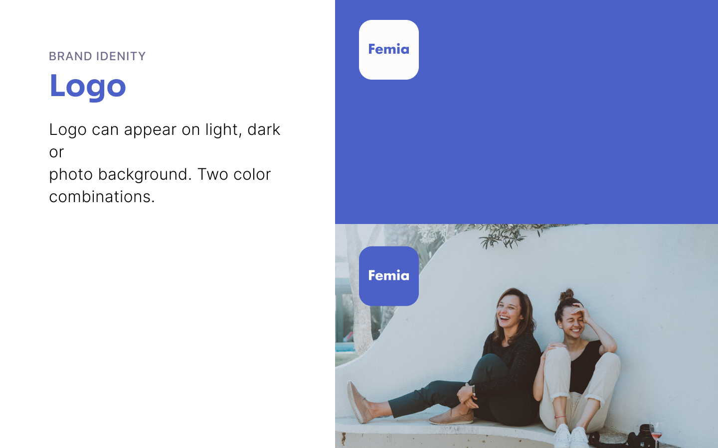
The logo is deliberately minimal — a clean wordmark that works at any size and on any background. Simple text logo for maximum recognition and communication clarity.
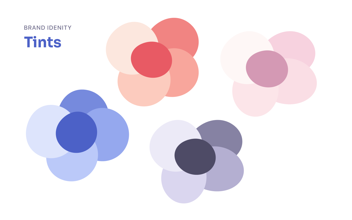
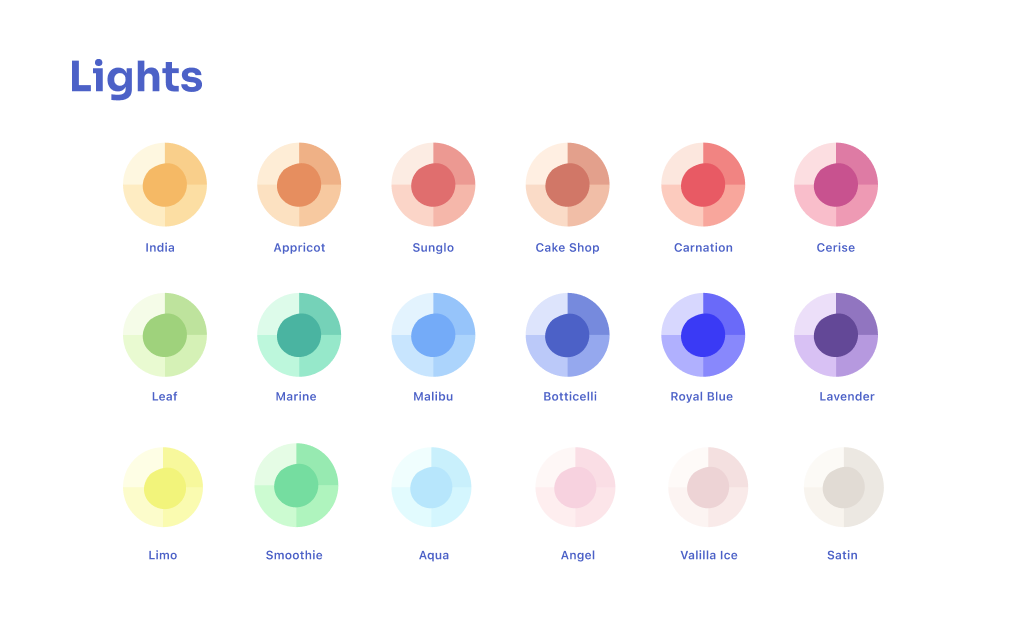
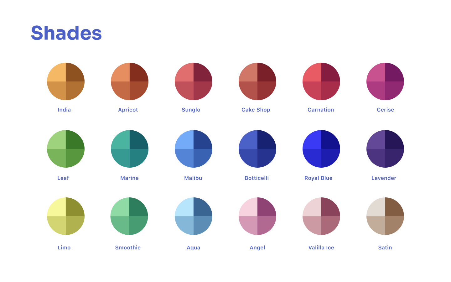
The colour palette is built around Bottichelli (a warm periwinkle blue) as the primary brand colour, paired with Carnation for warmth, and supported by secondary palettes — Smoothie, Aqua, and Angel — that give the content system its tonal range.


Brand elements & illustration
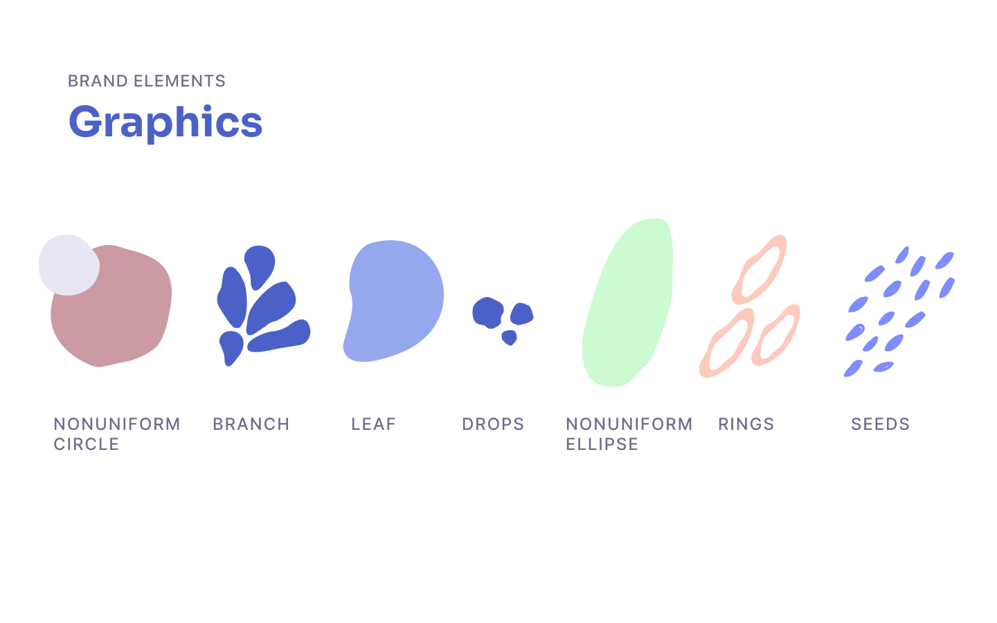
A set of organic graphic elements — circles, leaves, drops, rings, seeds — forms the visual texture of the brand. These shapes appear across the product, content, and marketing, giving Femia a recognisable decorative language that feels natural rather than geometric.
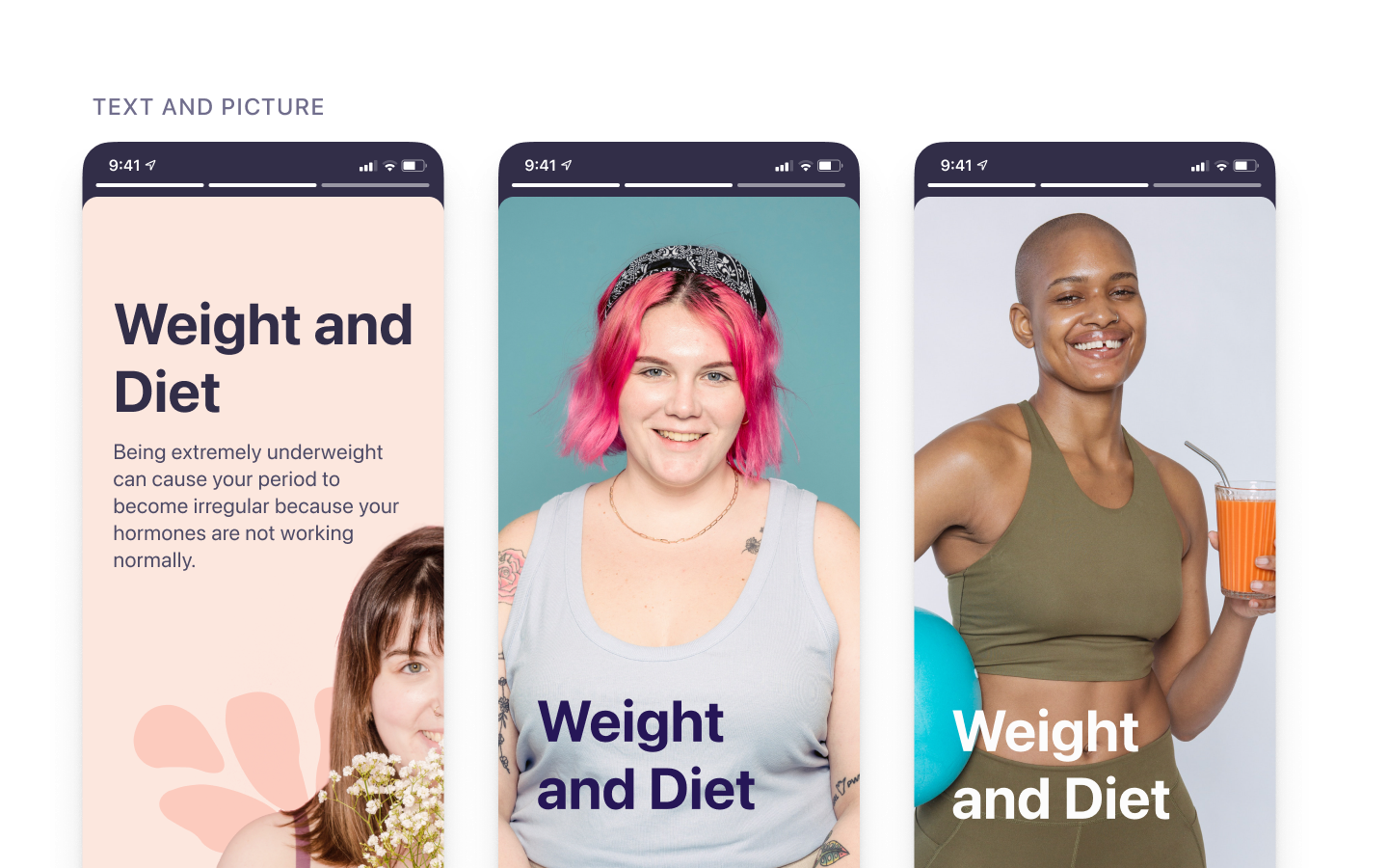
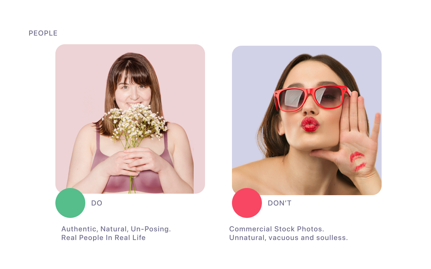
The illustration style was designed to represent real women across life stages and ethnicities — diverse, grounded, and never idealised. Photography guidelines reinforce the same approach: authentic, natural, un-posed people in real life.